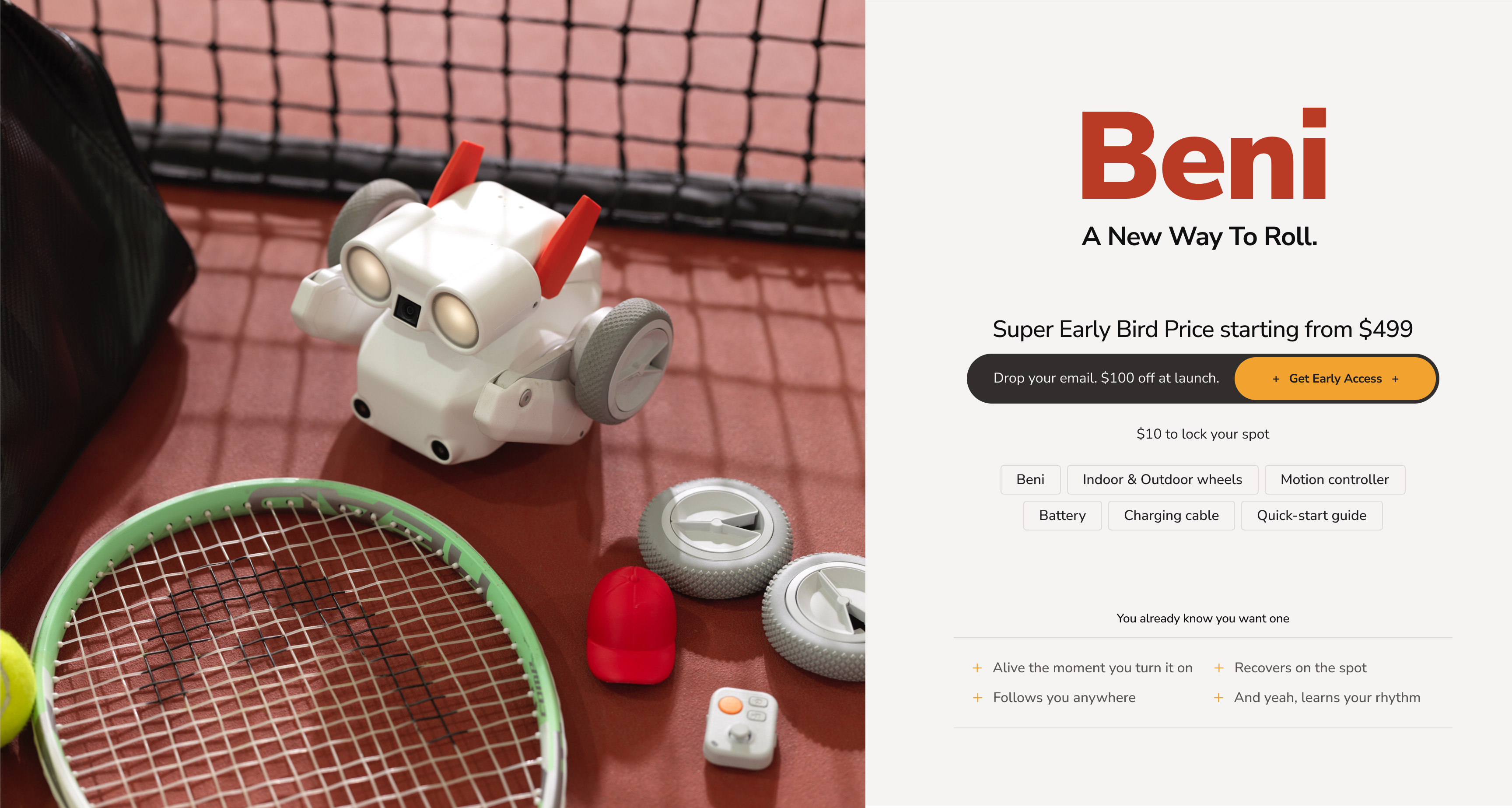
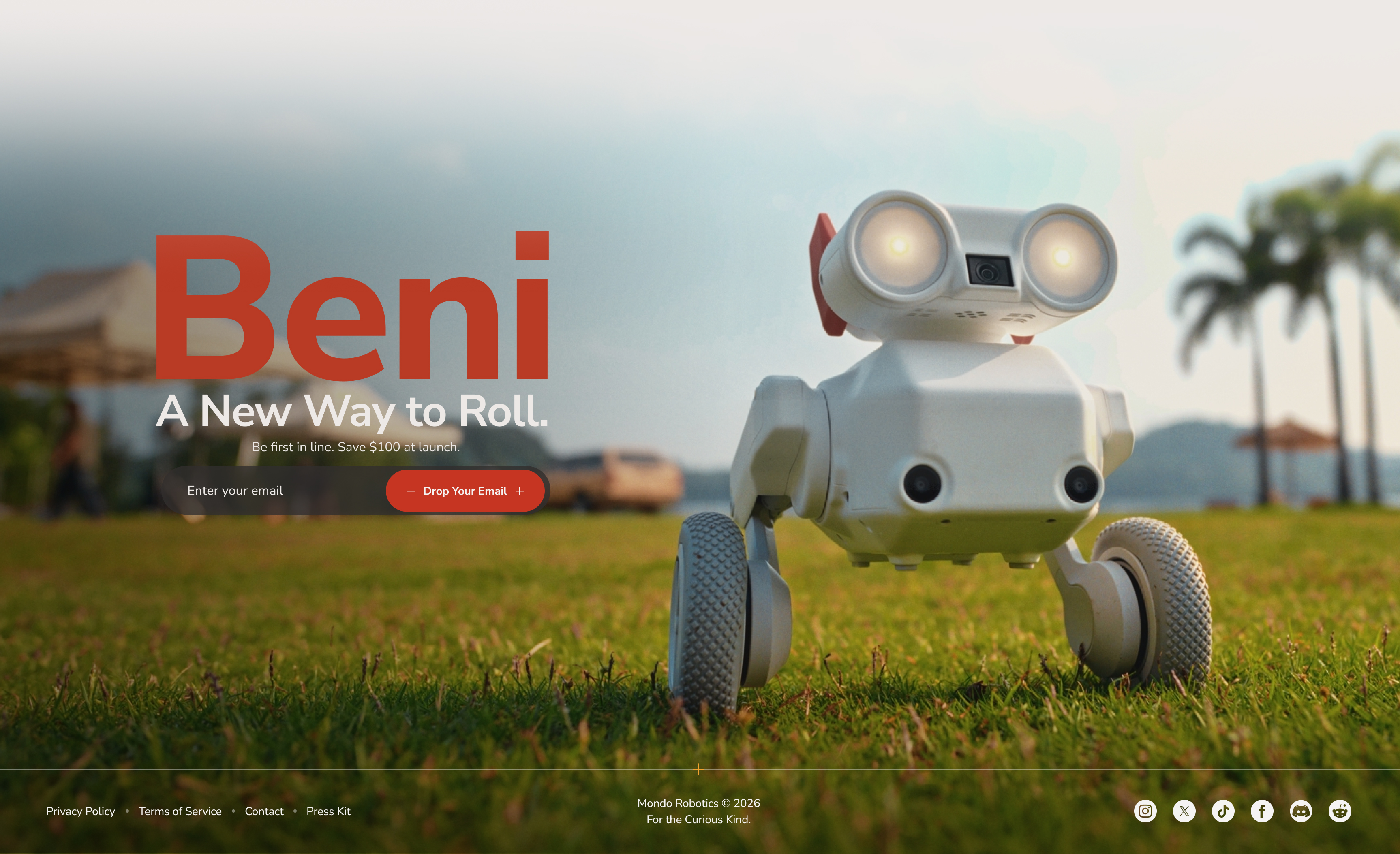
meet Beni
Your First Camera Robot.
$10 to lock your spot.
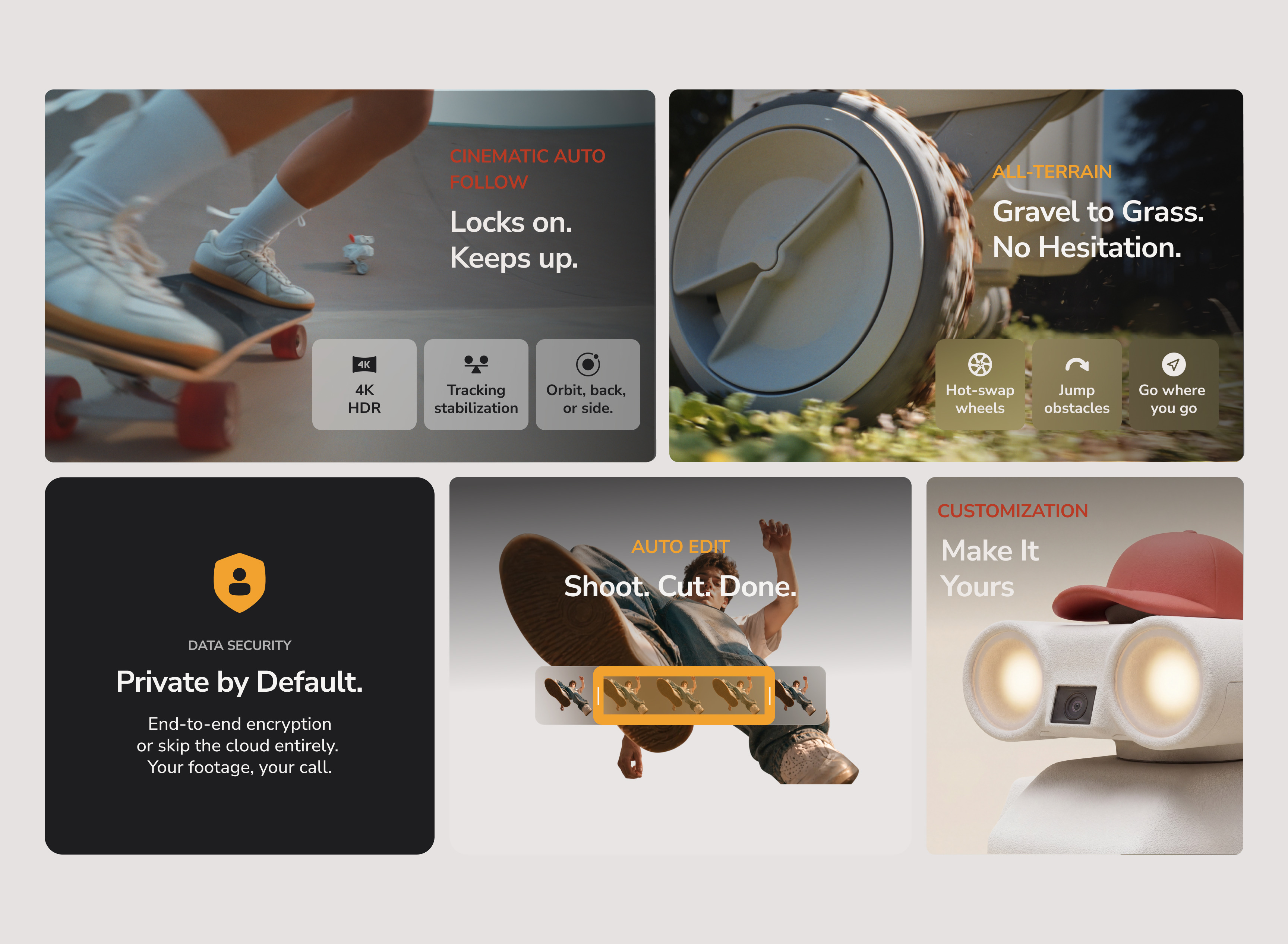
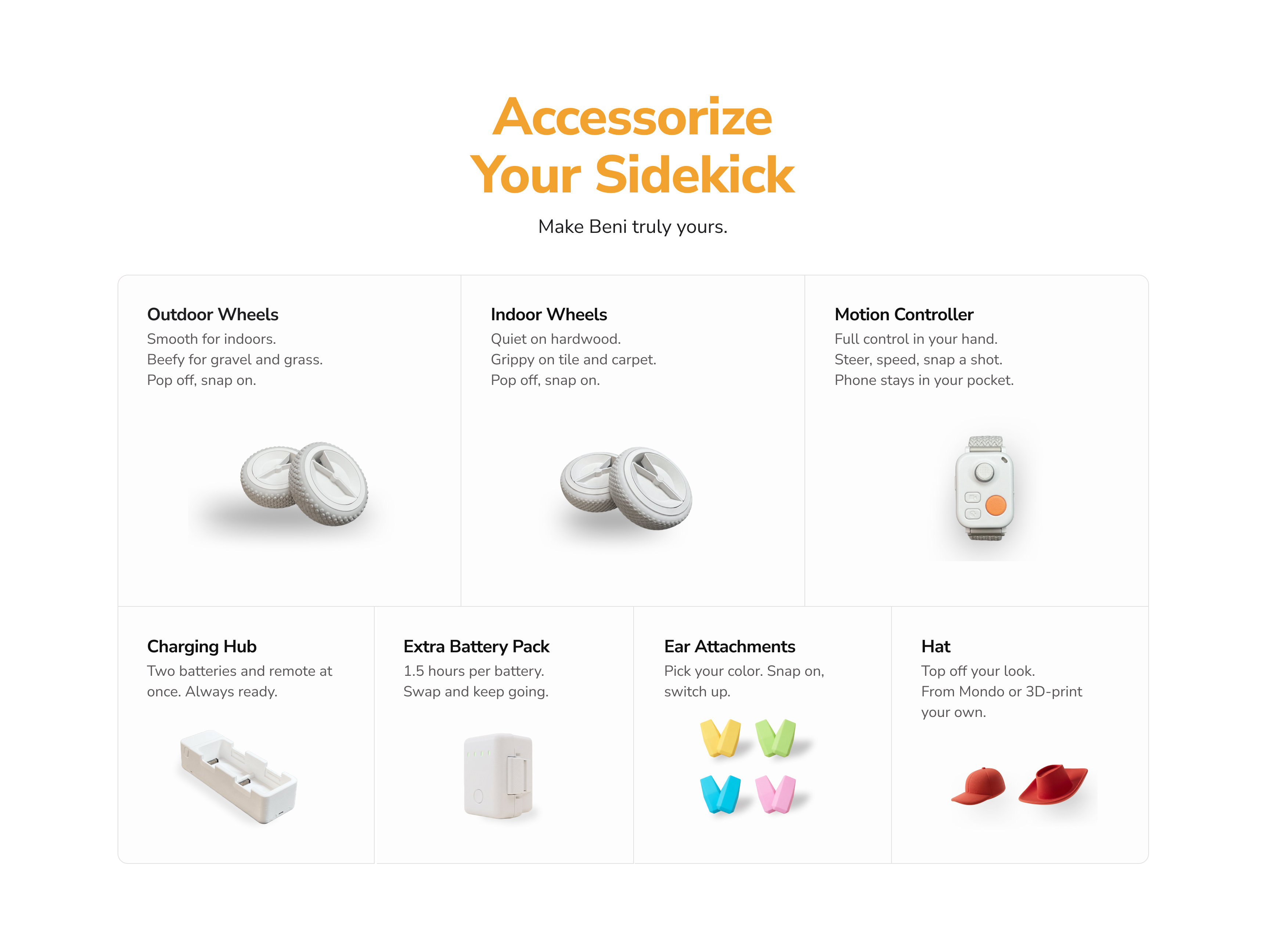
Drive Like You Mean It.
The Beni Motion Controller puts full control in your hand. Steer, adjust speed, trigger the camera — all without touching your phone.
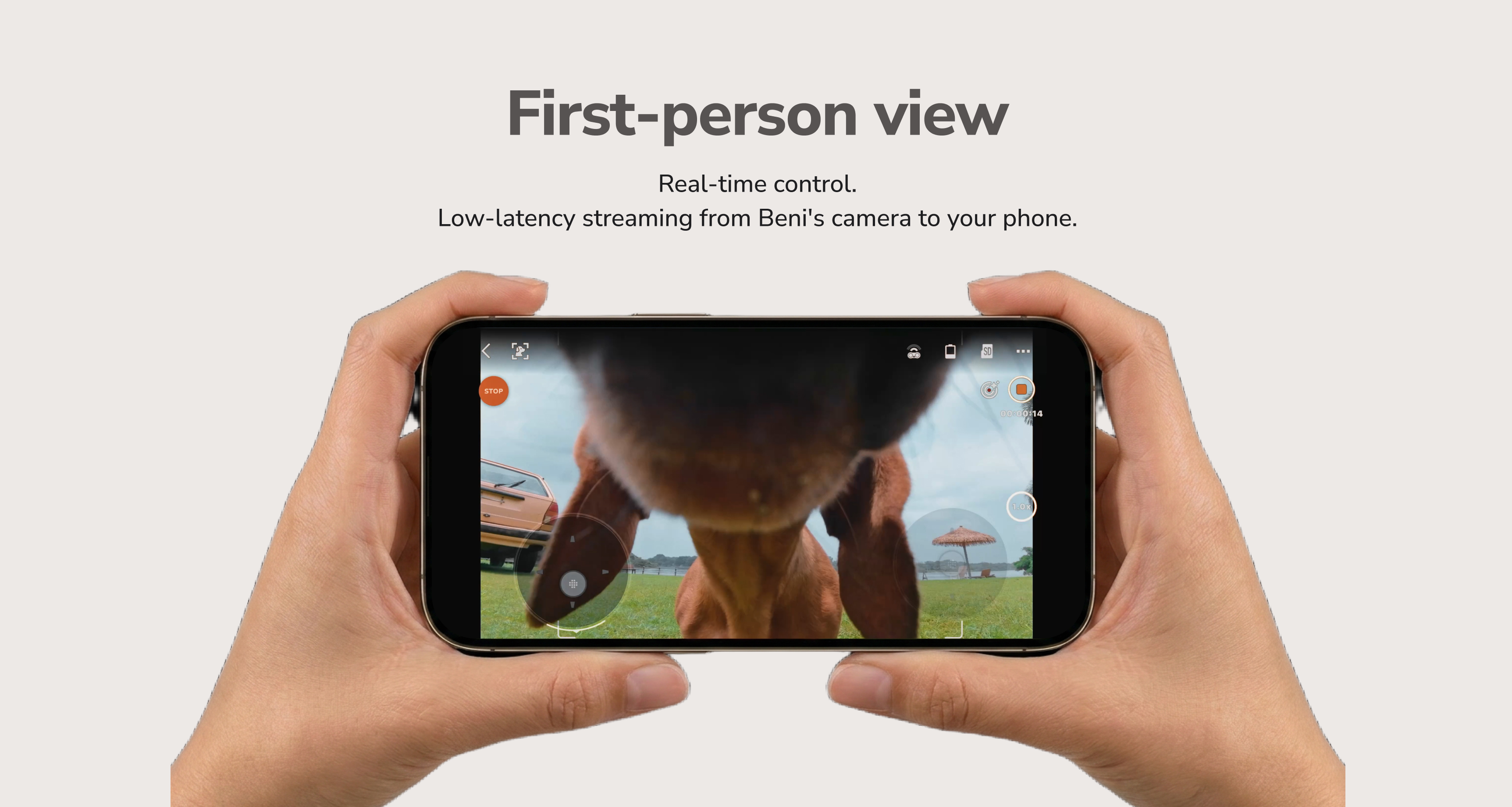
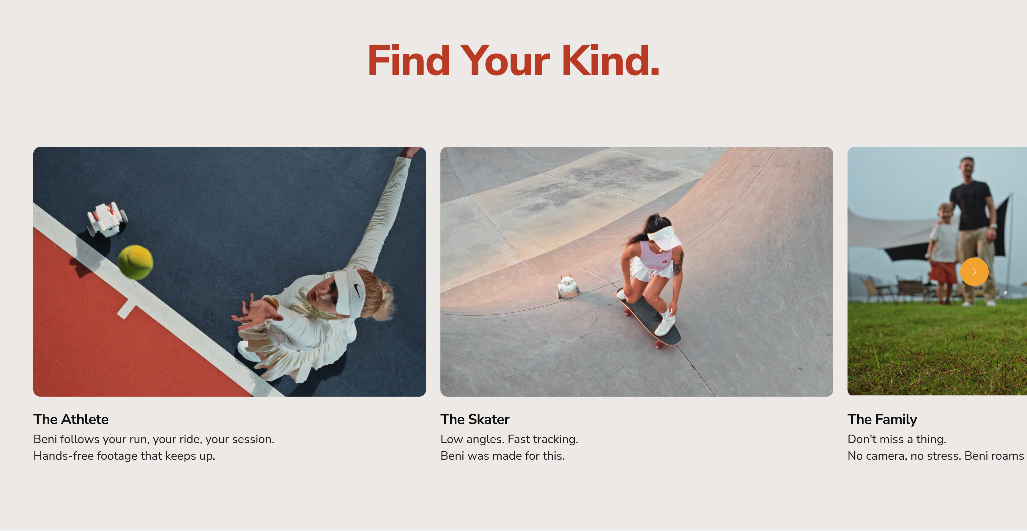
Play Anywhere.
Play Anyone.
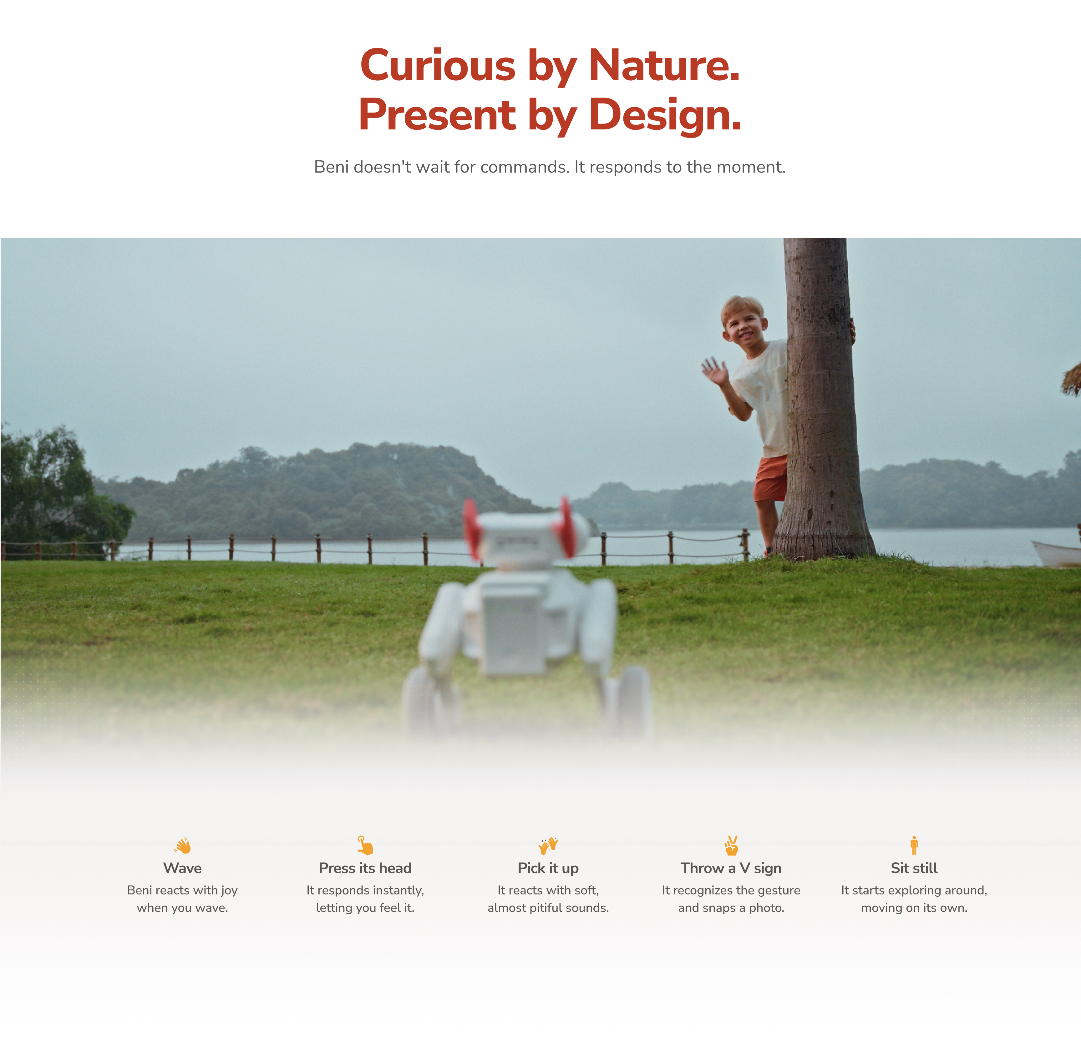
Tug of War
Two controllers, two players. Shake harder and Beni comes to you. Lose your grip and it's game over.